

NYU Athletics
Opportunity
NYU Athletics requested a re-brand that set them apart from the look of the university and provided them with their own identity. We looked to the deep history of the athletics program and the city to inform their new logo and colors.
Created in contract with Doubleday & Cartwright
Roles
Designer
Deliverables
Logo
Typography
Uniform Graphics
Color Identity


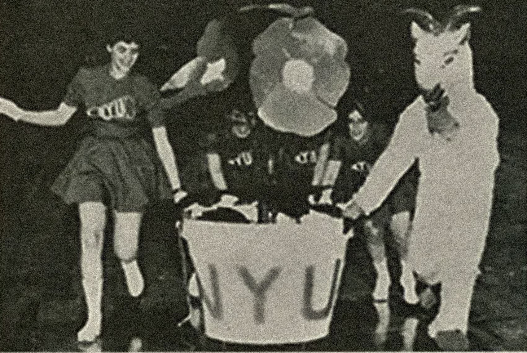


A Rich Athletic History
Inspiration for the typography was taken from the slab that the Statue of Liberty holds to create an angled slab serif to represent the fortitude of the athletic department.
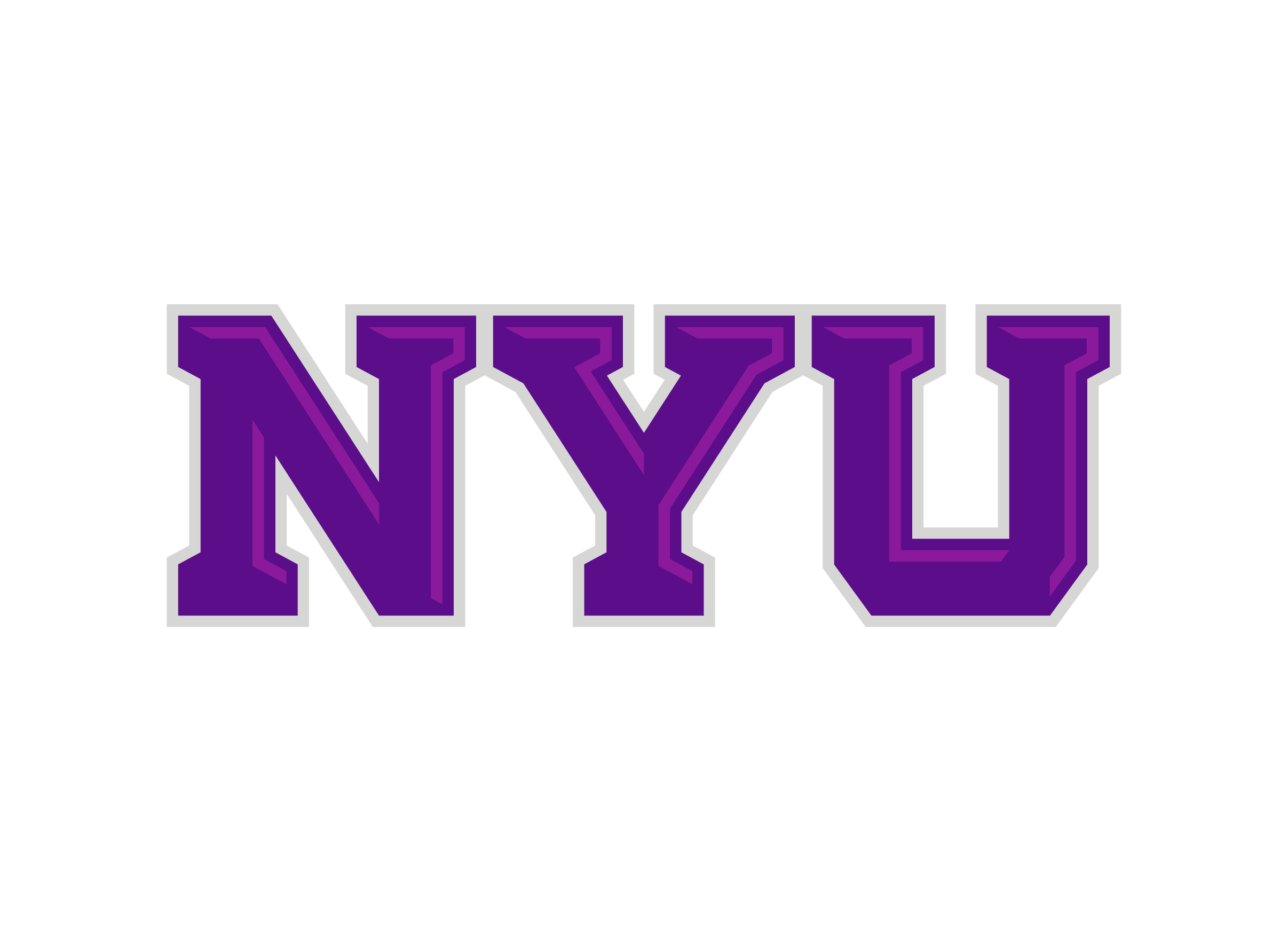


Primary Logo
Three simple letters that tell a big story, the NYU Chisel mark is an evolution of the classic varsity block, connecting to the history of NYU Athletics.
The slab shapes and beveled details evoke the Statue of Liberty and Washington Square Arch, architectural icons of the city and community.


Violets
The Violets wordmark is a proud declaration of the shared NYU identity. The sharp chiseled marks relate to other athletics marks and draw on the cutting edge creative and musical history of our Washington Square home.
The Violets wordmark is best deployed at a large scale where it can be noticed and read, and is the preferred primary mark on all home varsity uniforms.
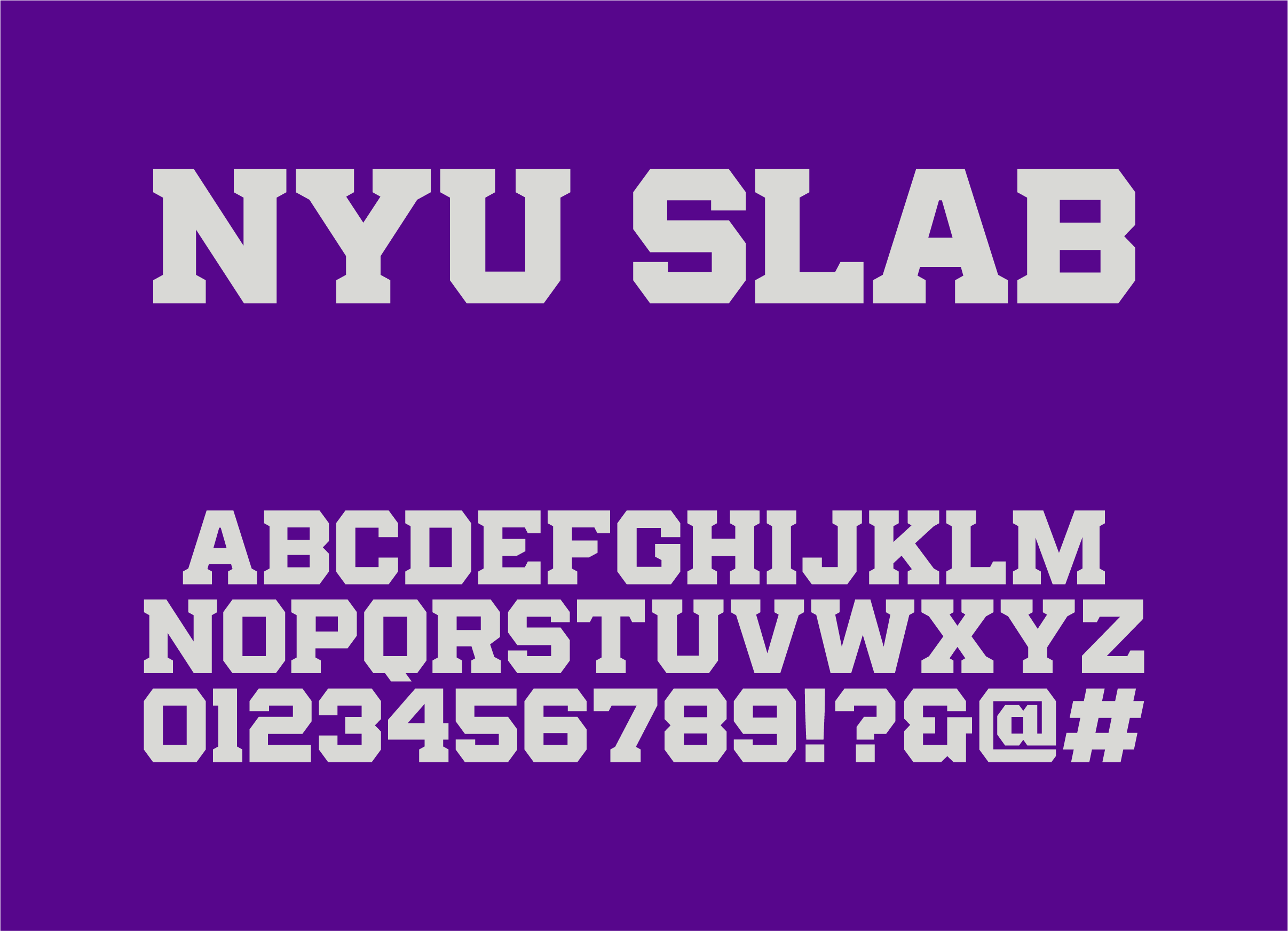


NYU Slab
This font was created in conjunction with the NYU Chisel mark. It has been put in use in digital communications and physical spaces.


Adoption by the University
It’s been a pleasure to see uniforms updates, social media execution and over all adoption of the new identity.