

Nike
Let's create a complimentary graphic identity for Nikes Olympic Athletes that will launch them on to the medal stand.
Challenge
When the 2018 Winter Olympics were coming to a crescendo, the clock started on 2020. The Summer Olympics are the quadrennial jewel in the sporting timeline. This moment needs an identity that emotes unity & strength.
Deliverables
Typeface
Graphic Apparel Applications
Opportunities
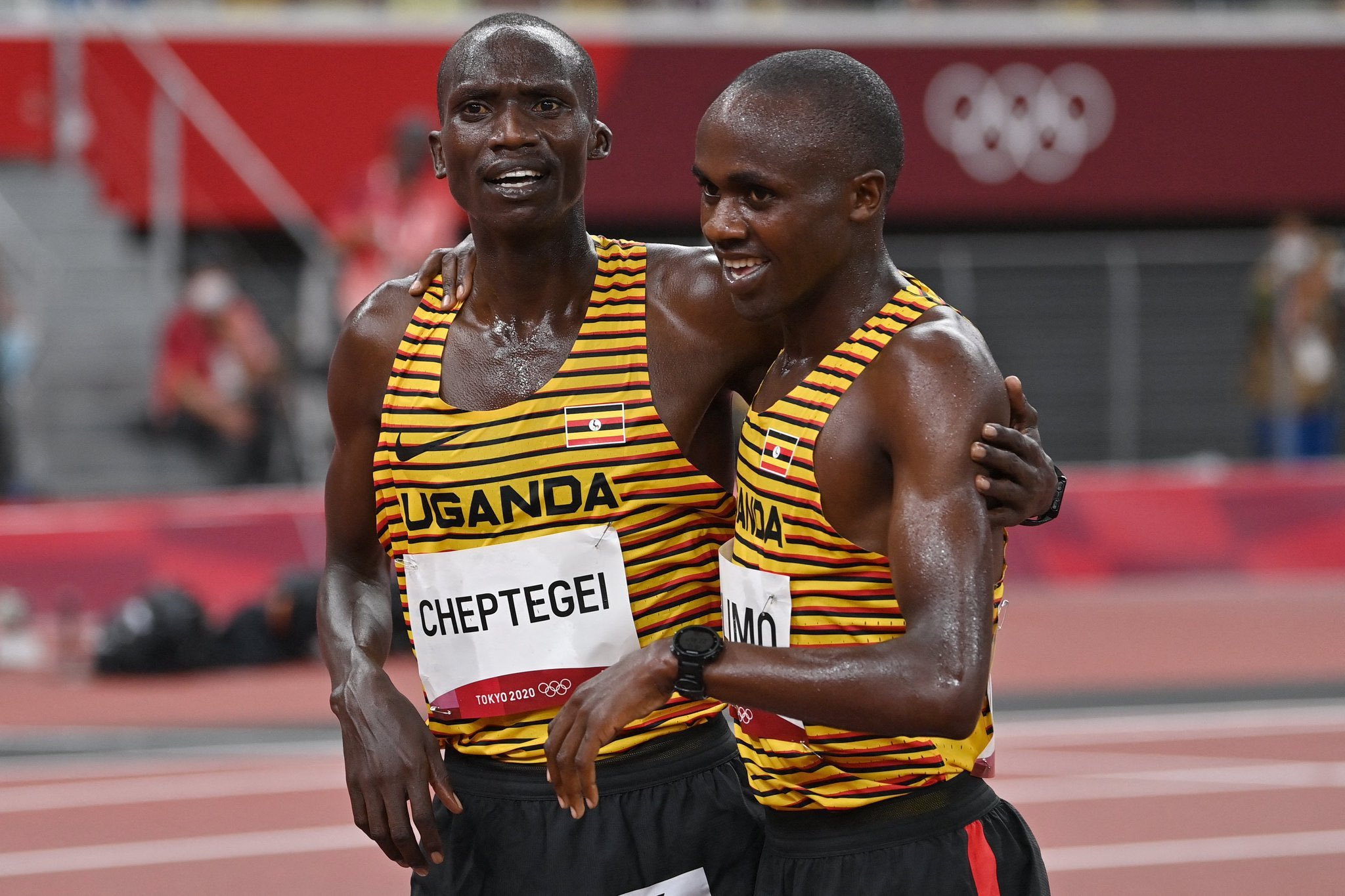
The responsibility to create a a letterset was placed in front of me. This typeface’s journey was going to be a path of functionality. It was to be applied on the 2020 Athletics Uniform pieces that were engineered from an entirely new Nike Dri-FIT Aeroswift material. Its other goal was to be readable by the timekeeper's and television viewers. The legibility for non-english speaking athletes was also highly considered, keeping anything abstract out of the equation was important.


Type Research
It was a daunting task creating something that felt new but still rang in with the global nostalgia that the Olympics carry.

East Capital
The font was created with 3 weights and 2 widths, with a grid potential to bring into a variable font for use outside of the uniform kit application.The letterset is named after the host city Tokyo.


Results
Nike was a clear success in the Tokyo Olympics. Nike sponsored athletes were responsible for 53 medals in Track & Field, earning 17 golds. This is excluding other sports.

Data from track-stats.com
Takeaway
Would have loved for this to have informed the styling of the brand campaigns.
Finding a better solution for attaching the athlete number in track & field would help with drag on runners and eliminate the use of safety pins that attach to the tops.